When Walter Gropius formed this institute in 1919 he wanted to combine both fine and applied art and to have architecture as the centre of all creation. After all, where do you hang or store artwork such as paintings, tapestries, or furniture. His belief was that all artwork revolves around architecture and with this philosophy he built a pioneering institute of which the standard curriculum for art schools is still used to this day. By this I mean having a one-year foundations course and having a set of teachers instructing fine art such as drawing and painting and having another set teaching applied art such as material fabrication.
In the early years bauhaus standards were quite open compared to the mid to late years. For instance, there were less limitations when it came to expressiveness in artwork. Students could use any colour and typeface. However, a few years later the heads of the school wanted to implement new rules that would distinguish a much more recognizable look. The use of the primary colours, red, blue and yellow, was to be given priority. Someone who ran with this idea was Piet Mondrian whose use of the simple colours would become synonymous with his work. And when it came to fonts, the use of serifs and line weights were eschewed. The use of uppercase letters was also frowned upon. This is naturally difficult to do in the German language because all nouns no matter their placement in a sentence is capitalized.
Of course, the idea of simplifying objects to their basic geometric shape was also a staple for bauhaus design. A prime example of this would be Marianne Brandt’s tea infuser which can often be found in books regarding top innovative designs of the 20th century. Marianne Brandt understood reducing shapes to their basic form for minimalist aesthetic and function.
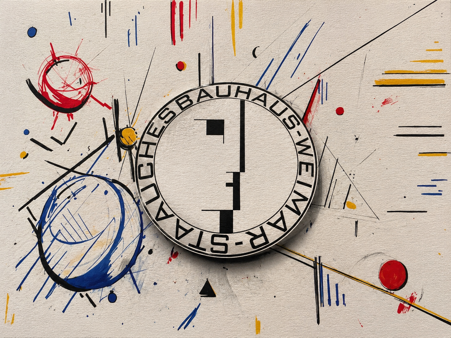
Bauhaus was very short-lived. Under the Weimar Republic it thrived but in 1933 when Hitler’s Nazi party came to governmental power it was shut down because they believed that the modernist art movement was despicable. To me, this is ironic because much of the artwork produced by Bauhaus especially the graphic designs were very much in line with bauhaus theory. When observing the Black Sun logo one can find similar elements to the Bauhaus seal. In fact, in the original seal seems to have a swastika located in the top right.
The Nazis culture minister did offer a condition in which the school could continue to operate. The condition being that the institute abandoned all ties to modernism and agreed to become a propaganda tool for the third Reich. The school’s director at the time Mies Van Der Roe denied the offer and the school was no longer in operation.
It seems that when this ultimatum came to fruition most of the faculty and students fled Germany.
A harsh critic of Walter Gropius’s once said that the only good thing about Bauhaus was the name. When translated into English the word Hausbau means “The building of a house”. Gropius simply yet cleverly inverted the words and formed bauhaus which took on a new meaning:
THE HOUSE OF BUILDING.
works cited
Adler-Gillies, Mira. “The Bauhaus Legacy Is Darker than Many like to Imagine.” ABC News, 29 Mar. 2019, www.abc.net.au/news/2019-03-30/nazis-shut-down-the- bauhaus-but-design-school-legacy-lived-on/10947778.
Forms in modernism : a visual set : the unity of typography, architecture & the design arts / Virginia Smith.2005